April 18, 2020 – As more detailed corona charts and stats become available in Croatia, so too some rather encouraging trends.
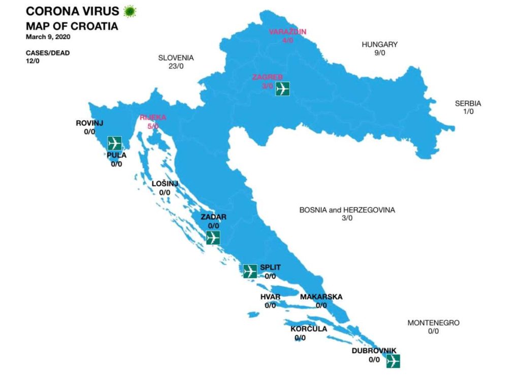
It is just 40 days – and yet several lifetimes ago – since TCN produced the first corona map of Croatia on March 9, 2020.
I like to look at it from time to time – things didn’t seem too bad back then, did they?

The response was huge, and it is the second-most popular article on TCN this year after the Zagreb earthquake.
And, as with most of the good stuff on TCN, the first corona map of Croatia had nothing to do with me.
“You know what is hot right now?” asked my clever Venezuelan colleague, Gustavo Vilera. “Corona maps. People want to see where the cases are. There is no corona map of Croatia.”
Since I have no idea how to add text to a picture, the likelihood of me designing a corona map was less than zero, but my wife is much better at these things and most other things as well.
Working on her iPad and without any sophisticated software, she produced a very credible effort, which she updated daily for us until Index and then Koronavirus started doing theirs.
A FABULOUS addition to the information flow and analysis this month is from those clever AI chaps at Velebit.ai, who have come up with perhaps the most details data and analysis in the form of corona charts that is available online for Croatia. You can access the corona charts here.
And there are some reassuring trends emerging, which give us all some hope. Recoveries higher than new cases for the third day in a row.
From left to right – Confirmed cases (orange), Recovered (green), Deceased (Red) and Active cases (Blue).
Daily percentage rise of confirmed cases.
Thanks for this Velebit.ai – really useful information.
For the latest coronavirus news from Croatia, follow our dedicated section.


