March 16, 2018 – Croatia boasts some cutting edge IT start up businesses, who are starting to make their voices heard on the global stage. One of the rising stars in the media monitoring business is Mediatoolkit. A look at what is new from their latest reporting innovations.
New: Use 2020 Charts for Media Analysis
March 16, 2018
By Iva Glavinić
I need personalised media analysis for a client, can we add a few charts?
We hear this question at least once a week on average, and it was always difficult for us to answer “no.”
The fact is that other media monitoring tools also do not have this capability, but since Mediatoolkit began we have been asking ourselves how can we be better than others, and not how to be the same.
If you as a user do not get more advanced options as we grow, then the value of Mediatoolkit in your eyes falls.
That is why, after more than a year of intense development, we introduced fully customizable reports last week.
What is a good media report?
How to explain the value of a communication campaign to someone who is not part of the industry? That is a common question for all PR and marketing specialists.
Clients and company managements generally have enough of their own obligations and are not interested in 30-page reports, however impressive they might seem at first glance. Especially if they do not see how the communication activities have contributed to their business goals.
That is why there is a difference between poor and good media reports:
Poor reports: Full of inflated and misleading data, meaningless numbers, no real value for the client.
Good reports: Include status before and after, clearly outline activities conducted, demonstrate results, suggest the next steps. All this in as few batches of data as possible.
Mediatoolkit helps you make good reports.
Note: We have found inspiration in Avinash Kaushik’s blogs about story-telling through the data. Although we have enabled the use of 2020 chart combinations, we do not think you need all or even most of them. So, in the next couple of weeks, we will write about how to find the best ways to present your data depending on the type of business you are involved with.
How to choose one of 3 types of reports in Mediatoolkit
There are three different ways to use Mediatoolkit reports.
Here they are ordered from the simplest to the most time consuming:
Default Interfaces (Basic, Detailed, and Comparative) – These are three predefined report types currently available. They are presented in default interfaces which include charts that are most popular among our users. For 90% of clients, the data from these three interfaces will be sufficient. If you do not overwhelm them with data, you will more easily focus the conversation on the ideas for the next campaign.
Custom Interface – When default interfaces do not have the information you are interested in, you can create a new interface and fill it with some of the about 30 charts which we have developed based on user requests. For example, if you want a report listing both your and competitor’s activities, you can do this through a custom interface.
Entirely new interface – Creating new reports for the most advanced and demanding users. You can completely disregard what we think is useful and compile your own data batches according to your needs. For example, you can see Sentiment by time, Influencer by virility and sentiment, or any other combination you can think of. This is intended for media analysts who know precisely what they are looking for.
The rest of the article deals with questions of selecting and setting up reports.
How to choose between Basic, Detailed and Comparative Report?
In Mediatoolkit, reports are offered with three types of interface: Basic, Detailed and Comparative. These are the differences:
- Basic: A quick overview of the campaign in real time. An excellent source of data if you are interested in how your campaign is spreading, or if you are interested in the sentiment or sources of new mentions.
- Detailed: A full campaign overview, including a more advanced view of information, such as sentiment by source, top influencers, locations and languages. Great solution for quickly presenting the campaign to a client.
- Comparative: As the name suggests, a comparative report compares different topics to see how they are faring online. An excellent way for competition comparison.
How to edit an interface using predefined charts
If you like predefined interfaces, but you miss specific charts in them, you can use them as a draft for your own report.
To help make this process easier, we have created some 30 chart templates, and we continuously add new ones according to our users’ demand. (You can ask for a new template yourself, just contact your account manager).
To access them, simply visit Reports (Beta) -> Create new interface -> Detailed view.
You can move your mouse over any chart – a “+” sign will appear, which can be used to add new charts.
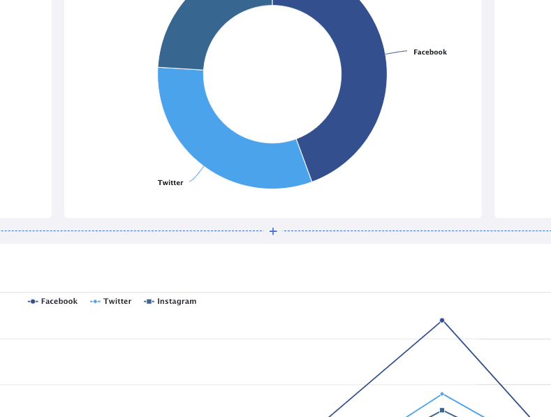
Click on the “+” sign, and you be forwarded to creating a report, which looks like the image below. You can choose between more than 30 charts:
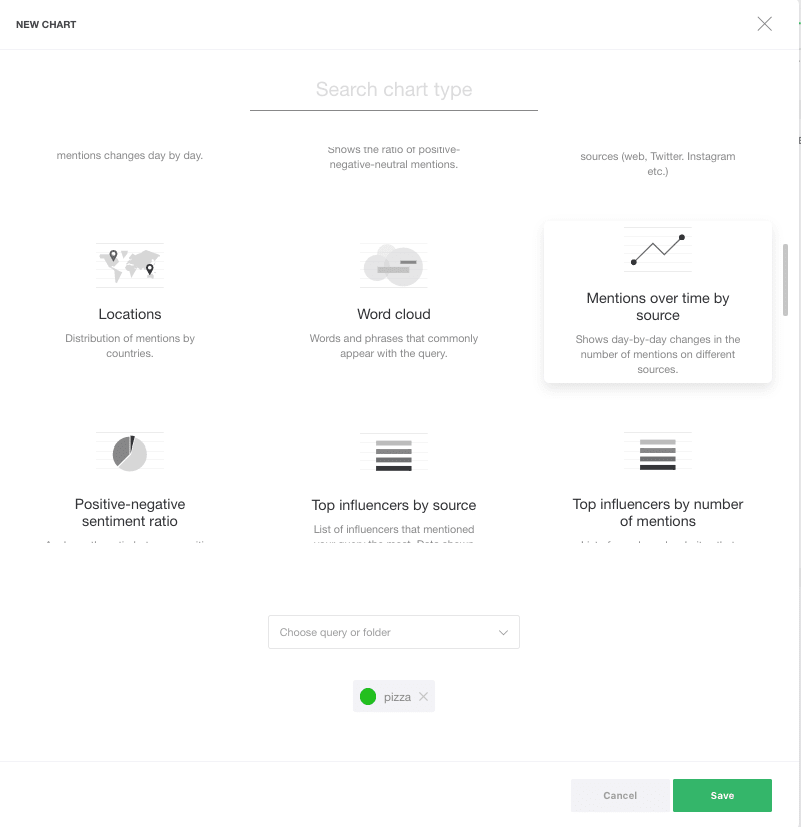
When you select a chart, just click “Save” and it will be added to your report.
It can also be helpful to combine multiple queries you follow. For example, in the same report or interface, you can have the information about both Hamburger and Pizza queries, in order to compare them.
How to create a brand new media report
If predefined reports and charts are not enough for you, you can create your own 2020 charts. You can use them to prove your expertise in media analysis to your client, save them in the interface to check on what is happening with the campaign on a daily basis, or simply to find out what is behind your mention numbers.
- Creating new reports
Click on Reports (Beta) -> Create a new interface.
Select the topic you want to analyse and enter the name of the new interface.
I have selected the topic of pizza because I want to make a sentiment analysis about pizza, so I have named my interface Sentiment on Pizza.
An empty report will appear. Click Add new chart -> Add blank chart.
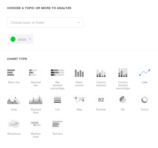
You can choose between 17 types of charts. It is important to know which data you want to see.
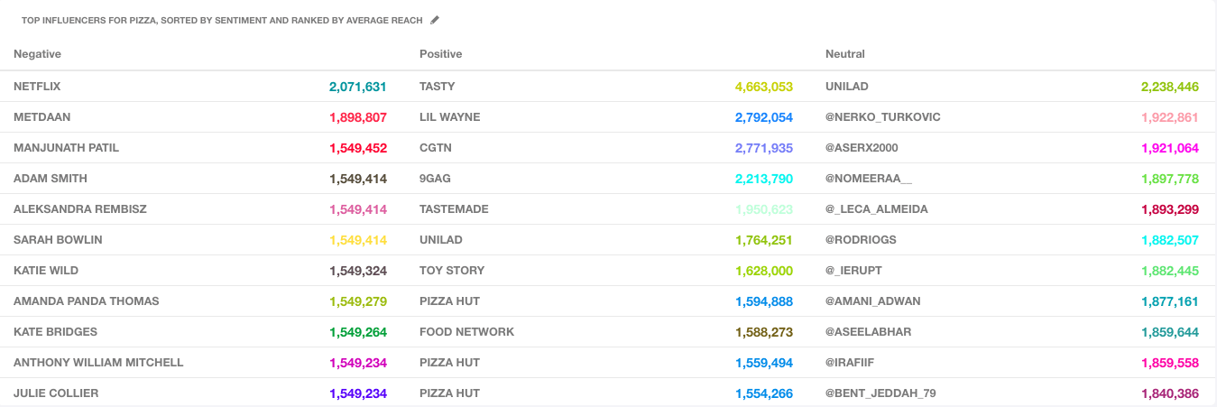
At the moment, I am working on a chart with all sources of mentions of my topic, but I want to categorise them according to a positive, negative and neutral sentiment.
This chart is actually a List, so I choose this option in the menu:
- Selecting Dimensions
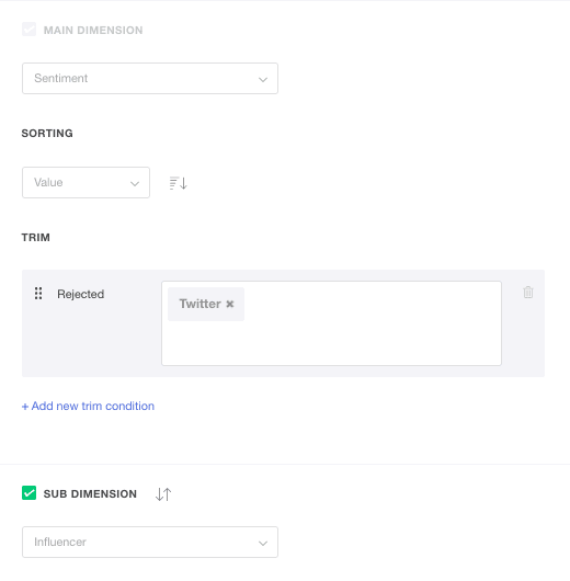
After the time period, you need to choose First Dimension.
The first dimension is the first batch of data you want in the tool. We have a total of ten dimensions, which includes analysis according to sentiment, location, markers and influencers.
In this case, I choose Sentiment (because I want to make a list based on sentiment).
Next, we will explore the Sorting option.
Sorting by type sorts a list alphabetically.
Sorting by value sorts a list according to numeric values, such as number of mentions, influencer results or similar.
For Sub Dimension, I have selected Influencers (because I want the sentiment table to show influencers) and Sorting by value.
Next, it is possible to exclude results by multiple filters. For example, you can eliminate all the results except for the top 10 influencers, or remove Twitter users from the list.
This is how the current setting looks like:
- Selecting a chart value
The last step is to select the Chart values.
The chart value will list all the influencers based on the type of data that their mentions contain.
The options are:
Count – Number of mentions
Reach – Reach of mentions
Influence Rate – Assessment of the influence rate on a 1-10 scale.
There are also sum, min, max, and average options for combining data.
These functions work the same way as in Excel or Google tables:
Count + sum counts or adds mentions and ranks them. So, if an influencer mentioned your company 20 times, he will be listed above an influencer who did it only once.
Average + reach sorts everything according to an average reach, regardless of how many times individual influencers mentioned the company.
Min and max take into account only numerically most extreme mentions; for example, min + reach will list the influencers with the smallest reach.
End result:
Note: For beginners, most of this terms are probably unknown, so if you cannot find your way, just contact us via chat and we will be happy to help.
As mentioned, we need your opinion to make the reports even better and more intuitive. Let us know about all your compliments, criticism and ideas.
Do you want to try out our reports, but are not our user yet?
Sign in here.

