May 13, 2020 — Here’s another analysis of the situation in Croatia in relation to other EU member states as of May 11.
The central place for all information about coronavirus in Croatia is koronavirus.hr.
You can find some good visualizations of the pandemic in Croatia on the visualization of the coronavirus pandemic in Croatia Mireo and the visualization of the coronavirus pandemic in Croatia Velebit.ai.
A graphical representation of the number of deaths from or with SARS-CoV-2 virus per million inhabitants per country places Croatia among the five best-positioned countries, with the lowest proportional number of victims (the source is the Johns Hopkins University coronavirus database). Along with Croatia, there are Greece, Poland, Bulgaria and — according to available data, the most successful — Slovakia. The next group with a lower mortality rate is the Czech Republic, Norway, Hungary, Estonia, Finland, Slovenia and Romania. The worst has hit Belgium, Spain, Italy, and the UK. Compared to Croatia, due to its approach to measures to combat the epidemic, the often mentioned Sweden has about 15 times the number of victims per million inhabitants. Belgium has as many as 34 times more victims per million inhabitants.
Mentioning only the absolute numbers of registered infected persons or persons who have died from or in the presence of a new coronavirus by country does not give a true picture of the situation, given that there are huge differences in the population of individual countries. For example, Belgium with its 11.5 million inhabitants has 8,707 victims so far, while Italy with 60.5 million inhabitants has 30,739 victims, but Belgium has as many as 48% more victims per million inhabitants than Italy.
It can also seem that Germany with 7,569 deaths has a lot more victims than Sweden with 3,256, and in fact, the per million population Germany has 72% fewer victims than Sweden.
If we look at the state of the number of registered infected people on the same date, regardless of the onset of the epidemic in each country, as shown in the following figure, it is difficult to compare the development of the epidemic by country in parallel.
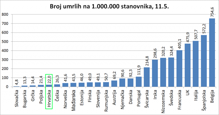
Mentioning only the absolute numbers of registered infected persons or persons who have died from or in the presence of a new coronavirus by country does not give a true picture of the situation, given that there are huge differences in the population of individual countries.
For example, Belgium with its 11.5 million inhabitants has 8,707 victims so far, while Italy with 60.5 million inhabitants has 30,739 victims, but Belgium has as many as 48% more victims per million inhabitants than Italy. It can also seem that Germany with 7,569 deaths has a lot more victims than Sweden with 3,256. In fact, per million Germany has 72% fewer victims than Sweden.
If we look at the state of the number of registered infected people on the same date, regardless of the onset of the epidemic in each country, as shown in the following figure, it is difficult to compare the development of the epidemic by country in parallel. The slope of an individual curve in a period speaks of the speed of the spread of the epidemic, as far as can be determined from confirmed infections. We do not know the number of unregistered infected people.
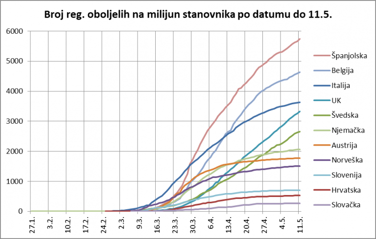
It can be seen that among the observed countries the epidemic first broke out in Italy. However, the growth in the number of patients in Spain (about a week later) was much faster than in Italy.
The number of patients in Italy grew to one million on March 30. Spain has the highest number of cases per million inhabitants among the observed countries, and the curve is just beginning to show a significant reduction in the epidemic.
The second fastest-spreading epidemic is Belgium, with a slightly lower growth rate than Spain, also with more significant signs of calming just begun last week. Italy, the third-largest country in terms of population per million inhabitants, has shown signs of calming down in the past three weeks.
The next two countries that currently have linear curves with no signs of calming down are the United Kingdom and Sweden. Sweden surpassed the number of registered cases per million inhabitants in Germany in early May, and will soon reach the number registered in Italy. Their own research indicates the likelihood of a large proportion of the population being infected but confirmed.
Slovakia and Croatia have had excellent control of the epidemic from the outset, and Austria, Norway, and Germany have successfully calmed the rapid growth that occurred in the week of March 23.
In the following chart, we offer an overview that begins for each country with the date when the infected person was first confirmed in that country. In this way, it is possible to compare the development and effects of epidemic control both in dynamics and in relative numbers per million inhabitants.
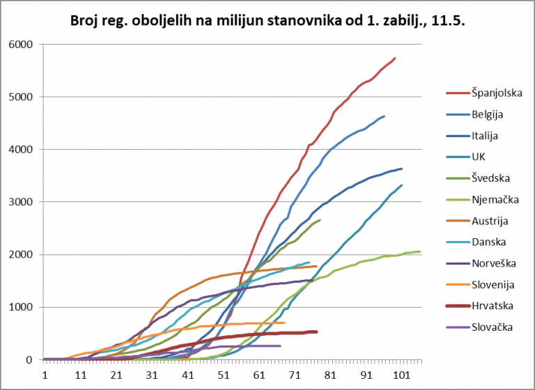
At first glance, two groups stand out among the observed countries. The left group is the one in which the epidemic developed relatively quickly after the first registered infected person in relation to the population: Austria, Norway, Denmark, Sweden, Croatia, and Slovakia. These are countries with a smaller population. The right group is the one in which more time has passed since the first registration of the infected person and these are countries with a larger population.
The first group shows a sharp increase in the number of infected in Austria, but also a very rapid reaction that reversed the course of the epidemic around the 32nd day, and even without “leveling” immediately achieved a consistent reduction in the number of newly infected. The epidemic has calmed down after about 50 days in Austria which, of course, has a big impact on deciding on further measures. The growth rate of the number of infected people from the 51st week is actually the same as in Croatia, except that in Croatia there is a significantly smaller number of patients.
The epidemic in Norway had a similar course with an even more abrupt start, but apparently with a quick reaction of the authorities, who reversed the trend also around the 32nd day and achieved a calming of the epidemic around the 45th day.
In Denmark, the epidemic began very similarly to Norway, the first calming occurred even faster, but after that, the linear growth continued at a rate higher than in Austria and Norway, and on the 70th day Denmark exceeded the number of registered cases per million inhabitants in Austria.
The same group is followed by Sweden, which initially did not have a sharp increase, but on the 55th day, it outgrew Denmark, Norway, and Austria in the number of registered infected persons. On the 66th day, it caught up with Germany, roughly following the development of the epidemic in Italy.
Seen in this chart, Croatia and Slovakia have maintained a very low slope curve almost from the beginning and have the lowest number of registered infected persons per million inhabitants.
In the group of larger countries, it is evident that the most difficult situation is in Spain, which after exponential growth until the 56th day of the epidemic on its territory managed to achieve linear growth first with a stronger slope, and then from about 62 days with a slightly milder but still large slope. Signs of calming the epidemic the week before last were somewhat disrupted last week.
It is similar in Belgium, which straightened the curve around day 54, but has since maintained a uniform but high (relative) increase in new infections with signs of calming the week before last, but a re-emergence of the epidemic last week.
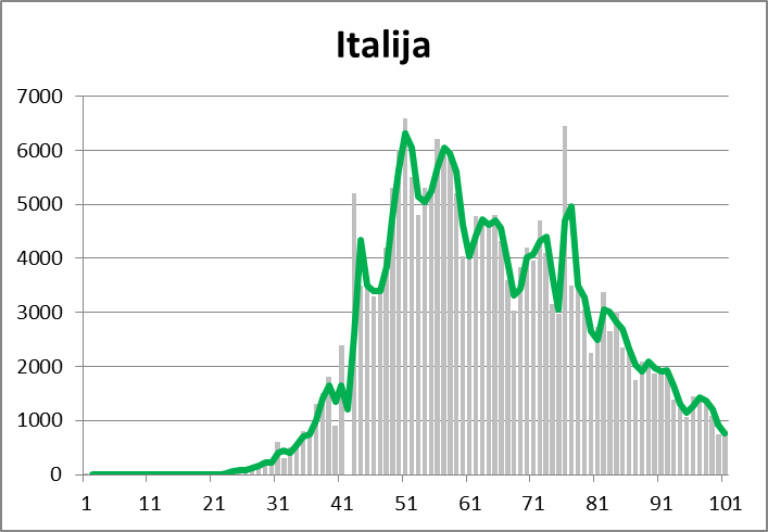
Italy, whose exponential curve started about a week before the one in Spain, achieved a more moderate slope of the linear part of the curve around day 49 and shows a slight but continuous calming of the epidemic after about 81 days.
With a certain time lag relative to the first registered infected person, Germany achieved a curve similar to Austria with a change of trend around the 68th day, but its growth rate of the number of infected in the last part of the curve is still higher than in Austria.
The United Kingdom managed to straighten the curve after exponential growth around the 70th day, but to this day without any sign of calming down. With this increase in new cases, they will quickly catch up with Italy.
If we take a closer look at Sweden we can see a form of exponential growth in the number of infected that has turned into a linear one in the last three weeks.
The following graphs will compare the dynamics of the epidemic by individual countries.
The curve shows in a different way a sharp daily increase in the number of newly registered patients until about the 50th day and then a very uniform and controlled calming.
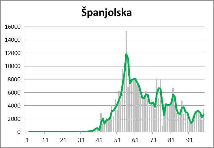
Spain, after an incredibly rapid spread of the epidemic, which reached as many as 15,400 newly infected on the 56th day, is very slowly lowering that number, and in the last week, this trend has been reversed.
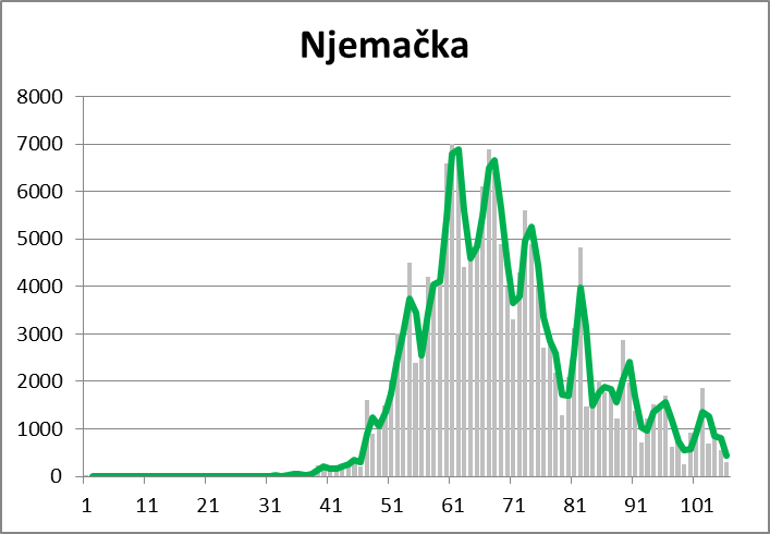
As can be seen in previous charts on the epidemic, Germany has very successfully reduced the number of new infections after reaching a peak between days 61 and 68, with the trend deteriorating slightly last week.
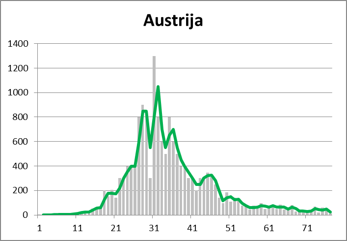
And this chart shows that Austria managed to stop and calm the epidemic very quickly.
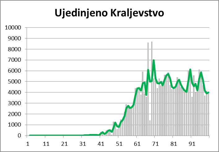
This chart contributes to the understanding of the UK curve as shown in the previous summary charts. After the exponential growth has stopped, the daily number of confirmed new infections is practically the same, about 5,000 per day, and there are no indications of a decrease.
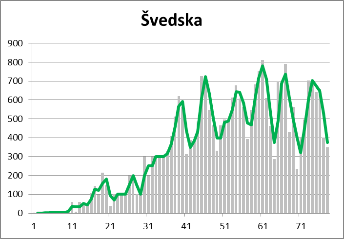
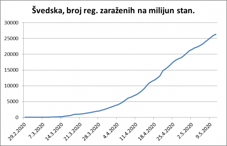
Similarly, the curve of the daily number of newly infected in Sweden otherwise shows the linear growth as shown in Figures 2 and 3, with the caveat that in this case an interesting approximately weekly periodicity is recognized.
Although the following graphs do not show exactly R0 (an epidemiological statistical indicator that indicates how much one infected person infects other people in a given period), very similar information can be read from them. The last three weeks are shown. The situation is all the more favorable because the daily value is no more than 1, and all the more unfavorable because this value is higher than 1. Accordingly, the trend indicators are colored in green (a favorable period when the epidemic subsides), yellow (threatening period around 1), and red (an unfavorable period when the epidemic spreads). The longer the red period compared to the green, the more unfavorable the situation.
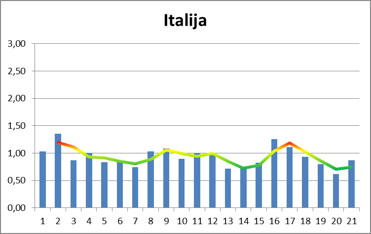
It can be seen that in Italy most of the time the curve is in the green area, which corresponds to the behavior of the curve in Figures 2 and 3, ie the trend of the epidemic subsiding.
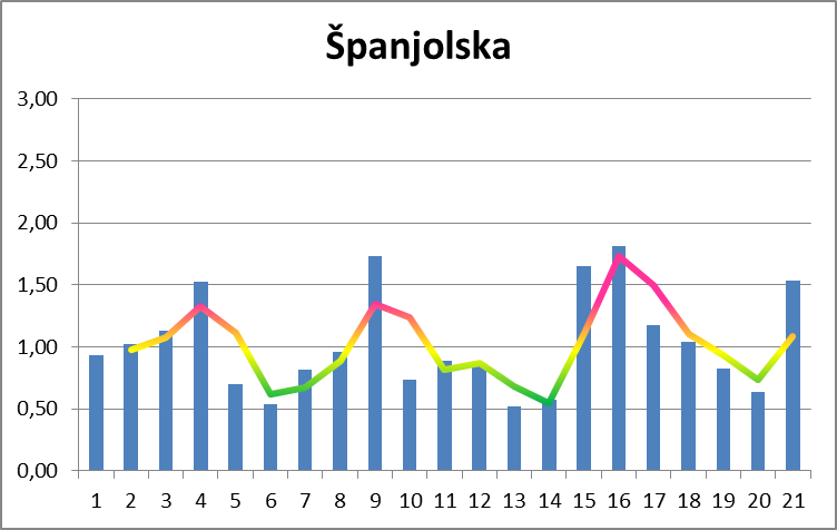
In Spain, this curve goes into the red area a lot, reaching over 1.5, which means that at that moment, two infected people infect three others.
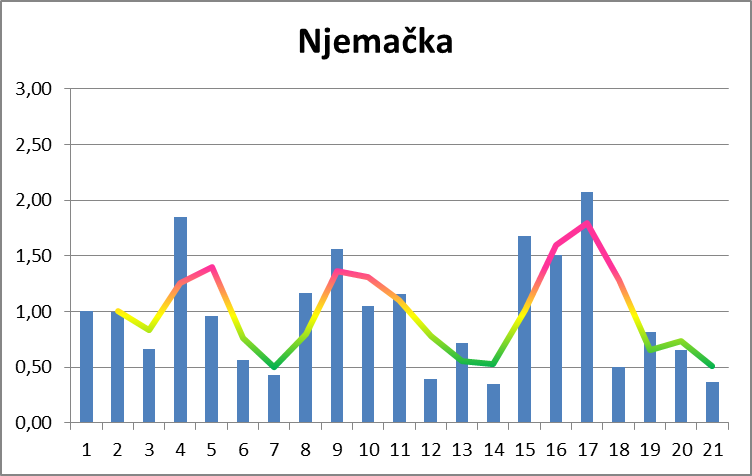
As German officials themselves have warned, the situation in Germany has deteriorated somewhat in the last week, as can be seen in this chart.
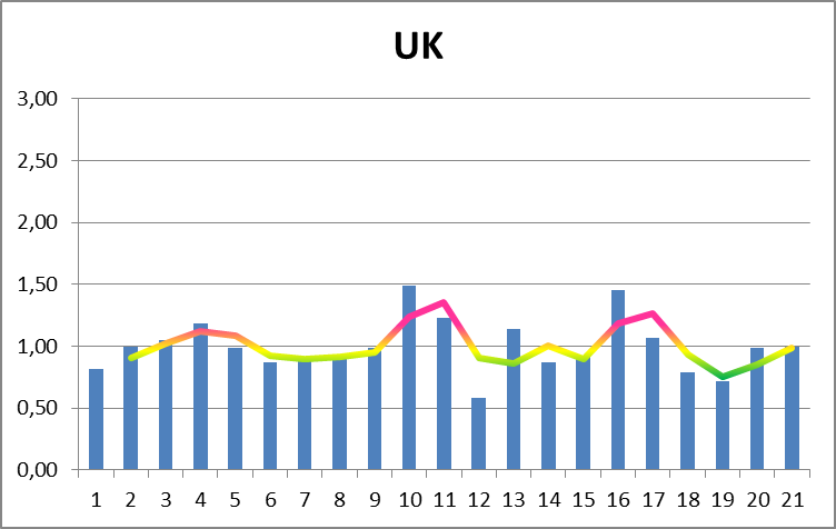
The situation in the UK is not good. The indicator generally ranges around 1, goes very weakly into the green, and more strongly into the red area. Therefore, the curve on the comparison charts for the UK is dire.
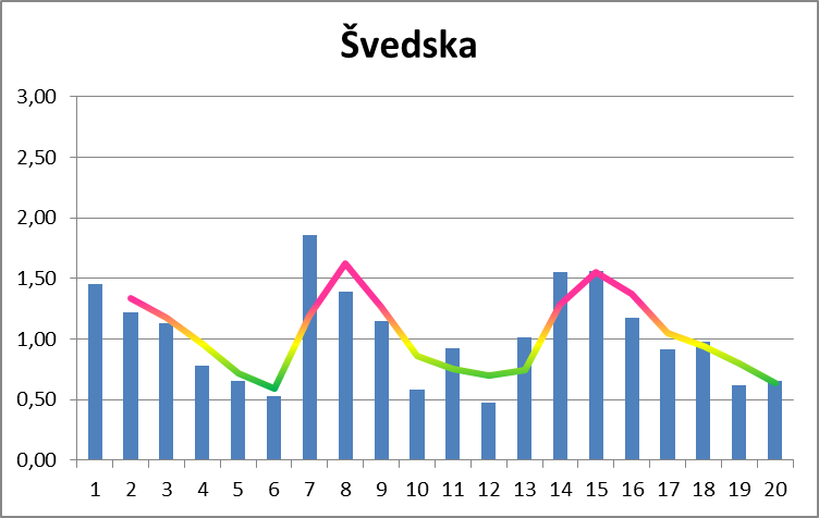
Sweden also shows variations in this presentation, and it can be seen that the indicator “spends” approximately the same amount of time in the green and yellow areas, which means that on average it is around 1.
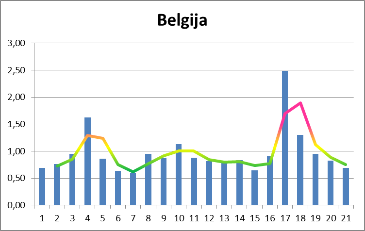
This graph also indicates that a major epidemic breakthrough has taken place in Belgium in the last week, and the previous two weeks are not particularly optimistic either, as the indicator was mostly around 1.
If we take a closer look at Croatia, we will see that the linear growth was already achieved around 22.3. (immediately after the earthquake in Zagreb), that an even better slope was achieved after 1.4., and that from 16.4. achieves a very successful calming of the epidemic. It could also be statistically concluded that the average recovery time of registered patients is between 3 and 3.5 weeks.
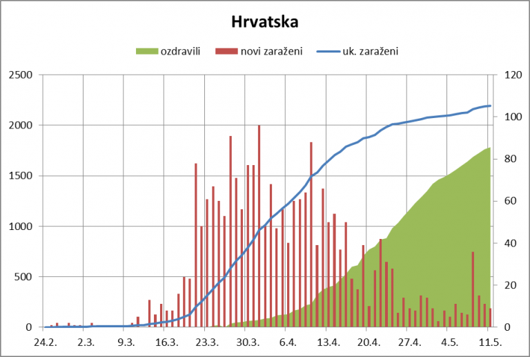
On the blue curve, it is easy to see how the high daily increment shown in the red columns after May 8, when the breakthrough on Brač was determined, is reflected.
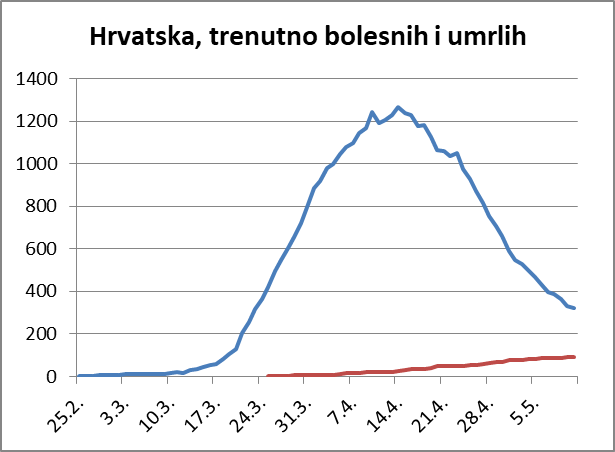
An excellent general result of Croatia can also be seen in the graph showing the movement of the number of patients. This curve significantly reduces the pressure for health facilities, so it can slowly return the entire health system to normal when it performs all its functions.
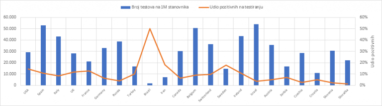
In these topics, the question often arises as to what is a good measure in testing and whether we test enough. An excellent graphical representation of the ratio of testing per million inhabitants to the percentage of positives shows who tests optimally and who does not at all. If you are around and below 10% positive, you have found a good measure – Croatia is.
When you look at the overall picture and compare it with other countries, you can clearly see that Croatian epidemiologists have excellent control of the epidemic. It is now up to other experts to make the best use of this favorable situation for the benefit of Croatian citizens.
Others rightly rank Croatia among the countries that have successfully defeated the coronavirus.
Given that decisions on crisis management, especially in the phase of easing anti-epidemiological measures, are not only health but also political, further careful monitoring of the situation and comparison with political decisions and health outcomes in other countries is needed.
Of course, every country can ask itself what its long-term perspective is in these new circumstances that will not disappear. States, which have curbed the epidemic in the sense that they have ensured that their health system can control the situation, develop further strategy than those who still have to make every effort to maintain the functionality of the health system.
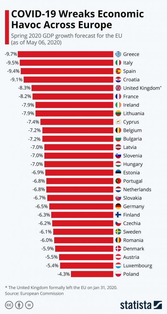
In all this, it is necessary to take care of the economic consequences of the crisis – lower estimates of the fall in GDP by EU member states. Due to excessive exposure to tourism, Croatia is unfortunately at the very top.
Subscribe to our newsletter
the fields marked with * are requiredRelated posts:
 Man Placed in Isolation in Osijek Hospital, Does NOT Have Coronavirus
Coronavirus Croatia: 2 More Cases Confirmed, Relatives of Existing Cases
COVID-19 Update: Partial Serbia-Croatia Border Closures, Meets of 100+ Banned
COVID-19: UK Government Publishes Updated Coronavirus Travel Advice for Croatia
Man Placed in Isolation in Osijek Hospital, Does NOT Have Coronavirus
Coronavirus Croatia: 2 More Cases Confirmed, Relatives of Existing Cases
COVID-19 Update: Partial Serbia-Croatia Border Closures, Meets of 100+ Banned
COVID-19: UK Government Publishes Updated Coronavirus Travel Advice for Croatia