April 22, 2020 — A graph showing the number of deaths from or with the SARS-CoV-2 virus per million population per country places Croatia among the five best-ranked countries with the lowest proportional death toll, according to the Johns Hopkins coronavirus database. In addition to Croatia, there are Greece, Poland, Bulgaria and – according to the available data – Slovakia.
The next group includes the Czech Republic, Hungary, Finland, Romania, Estonia, Norway and Slovenia, with the worst situation affecting Belgium, Spain, Italy and France.
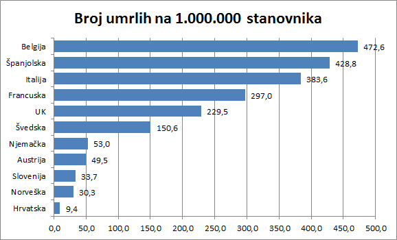
Compared to Croatia, often due to its access to measures to combat the epidemic, Sweden has about 15 times the death toll per million inhabitants.
Specifying only the absolute number infected persons or persons who died from or with the presence of the coronavirus does not give a true picture of the situation. There are huge differences in the population of individual states.
In this way, for example, for a very long time, the terrible situation in Belgium, with its 11.5 million inhabitants in absolute numbers (5,998), had seemingly far fewer casualties than, for example, Italy with its 60,5 million inhabitants (24,648).
It can also be said that Germany with 4,961 deaths has far more casualties than 1,765 in Sweden, which is not really the case. On the contrary, Germany with 83.5 million inhabitants is significantly more successful in fighting the epidemic than Sweden with 10 million inhabitants.
Likewise, it is difficult to compare the development of an epidemic by country in parallel if one looks at the number of confirmed infections persons at the same date, regardless of the outbreak of the epidemic in each country. Instead, we provide an overview for each country that starts on the date the infected person was first registered in that country. In this way, it is possible to compare the development and effects anti-epidemic measures both in dynamics and in relative numbers per million inhabitants.
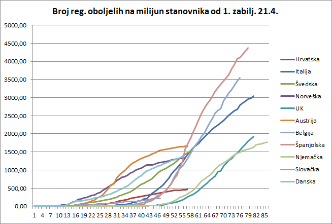
This chart does not show all the countries that were in the previous one, not only because such a view would become completely opaque, but also because of the abundance of data to be monitored.
At first glance, two groups stand out from the countries observed. The left group is one in which the epidemic developed relatively quickly after the first registered infected person in terms of population: Austria, Norway, Denmark, Sweden, Croatia and Slovakia. Of course, these are smaller countries. The right group is one in which more time has elapsed since the first registration of the infected person, and these are countries with a larger population.
In the first group, there was a rapid increase in the number of people infected in Austria, but also a very rapid response that reversed the epidemic as early as the 32nd day, and even without “leveling”, a consistent reduction in the number of new infections was achieved. The epidemic has calmed down after about 50 days in that country, which of course has a great impact on deciding what to do next.
The epidemic in Norway, with an even sharper start, had a similar course. The rapid reaction of the authorities reversed the trend around the 32nd day as well and achieved a calming epidemic around the 45th day.
In Denmark, the epidemic started very similar to that in Norway, but the epidemic’s spread slowed quickly but soon increased again. Currently, the curve is linear.
The same group is followed by Sweden, which initially did not have rapid growth but, by the 55th day, has grown in the number of registered infected persons and Denmark and Norway, and there is no sign of a slowdown.
Viewed in this chart, Croatia and Slovakia have maintained a very low slope linear curve since the beginning and have the lowest number of registered infected persons per million inhabitants.
The group of larger countries shows the worst situation is in Spain, which after exponential growth until the 56th day of the epidemic in its territory, was able to achieve a linear growth. Then from around the 62nd day, a slightly milder but still large slope with no indication that the epidemic would soon begin to subside.
It is similar in Belgium, which straightened the curve around the 54th day but has since maintained a steady but high (relative) increase in new infections with no indication of calm.
Italy, whose exponential curve started about a week before the one in Spain, reached a more moderate slope of the linear part of the curve around day 49 and shows a slight calming of the epidemic.
Germany, with some time lag compared to the first registered infected person, has achieved a curve similar to Austria, with a change in trend around the 68th day.
After exponential growth, the United Kingdom was able to straighten the curve around day 70, but without a stronger indication of calming.
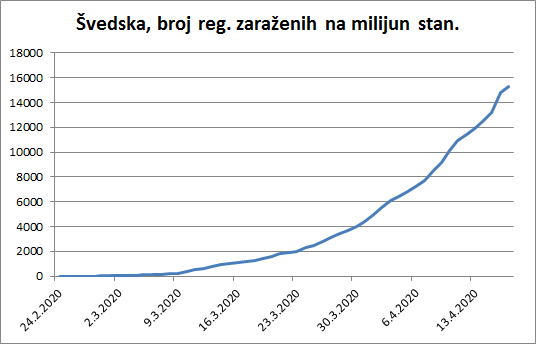
Let’s look closer to Sweden. We can see a form of exponential growth in the number of infected.
If we take a closer look at Croatia, we will see that linear growth has already been achieved around March 22 (just after the earthquake in Zagreb). An even better curve was achieved after April 1, and that from April 16 it can say it has stifled the epidemic.
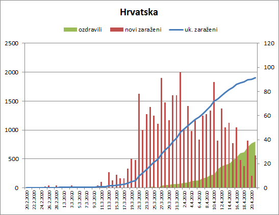
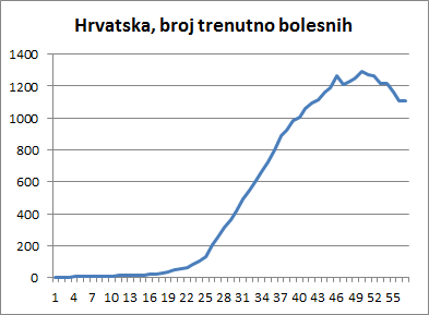
Croatia’s excellent result can also be seen in the chart showing the number of patients affected.
These topics often raise the question of what is a good test measure and whether we are testing enough. An excellent graphical representation of the testing ratio per million population and the percentage of positives shows who optimally tests and who does not. If you are about 10% positive you have found a good measure – Croatia is. Something ugly is coming to Brazil, only if the good weather saves them.
 Comparison of the number of tests per million and the percentage of positive ones – by Milan Stevanović 2104
From everything I think it can be concluded how useful it is when policies are established on the basis of scientific knowledge and data. Scientific knowledge, in comparison to the usual political ones, is neither conservative nor radical; they are simply as they are and should be trusted. But these lessons are not exclusively health, but equally political, especially when we talk about loosening up measures.
Of course, any country may be asked what its long-term prospect is in these new circumstances that will not go away. Some countries, which have curbed the epidemic in the sense that they have ensured that their health care system can control the situation, may be far more comfortable developing a further strategy than those who still have to put all their efforts into maintaining the health system’s functionality.
And finally – is coronavirus more dangerous than the flu? Yes, but as far as we may know, in just a few months, we learn something new every day. The important difference is that we do not have vaccines and that the virus can mutate more often in a large number of patients.
Krešimir Macan is a public relations professional and political analyst specializing in crisis communications. He has advised two Croatian Prime Ministers, including current Prime Minister Andrej Plenković. He also runs his own PR consultancy, Manjgura.
Krešimir provides TCN with regularly-updated analysis of coronavirus data, helping put Croatia’s pandemic response into context.