April 21, 2020 — I received some great observations from a colleague, so I asked him for permission to share them with you. He says that he is getting a little nervous about all sorts of things, and has started to keep his statistics for some European countries that are of interest to him. The statistics end on 04/18/2020.
Otherwise, click here for daily detailed visualizations of coronavirus data in Croatia, and for all our texts on this topic, see the keyword “koronavirus”.
The following are quotes and charts from a colleague.
The point in all the charts is that it makes no sense to express the absolute number of infected or dead or whatever by country because we mix potatoes and locomotives. It does not matter that Germany has over 80 million inhabitants, Belgium 11 million and Croatia 4 million. So I reduced everything to a million inhabitants and then you see things differently than what is said in the media.
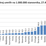
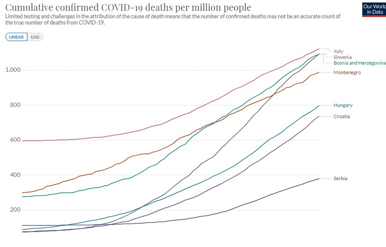
Coronavirus deaths per million population
This is the number of deaths from/with coronavirus. Of course, we don’t know if all these figures are correct (the source is Johns Hopkins’ coronavirus database), but let’s say they are accurate enough to see the proportions.
So there is no doubt how good Croatia is relative to the others in terms of deaths. Comparing this with Sweden, the situation is 16 times worse than in Croatia. And we can’t compare Sweden to Croatia in any way, and especially not to the strength of the health system or GDP.
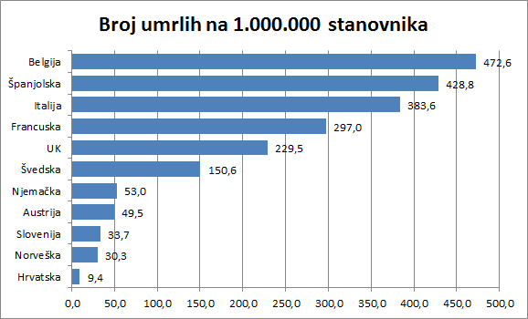
This is a comparison of the number of confirmed infections (the actual number of infected people we do not know) again reduced to one million inhabitants. All start on day 1, even though the first patients registered in different countries on different dates. Here you see too much of the forest to make out the trees. In any case, one can see here who has straight curves, whose grew exponentially, and who has inflected. Who is the best? Croatia.
Number of registered patients per million population, on the same dates, regardless of the fact that the first patients registered in different countries on different dates
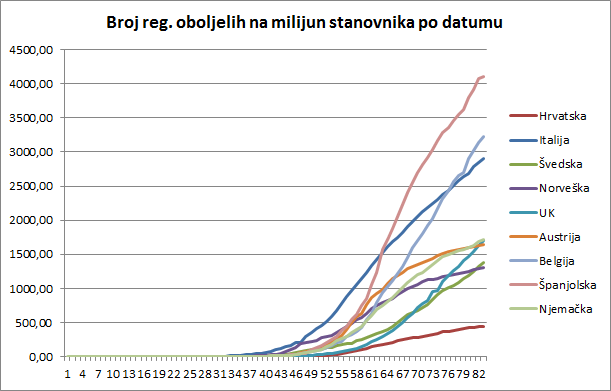
This to me is a far better overview. The curves here are not on the same date, but each begins on the date when the first diseased was registered in that country. Here you can see when who reacted and how.
Number of registered patients per million people, on the dates when the first patients were registered
Of course, Spain has the worst curve in terms of relative numbers, but it slowly (unfortunately, very slowly) calms the epidemic. Italy is also slowing the epidemic. Belgium has a terrible situation, but the curve is flat. The worst is the UK, which has barely evened the exponential curve. These countries, including Germany, have waited a long time without serious measures with few infected.
The second group responded quickly: Austria, Norway, Croatia.
Of course, Sweden cannot be said to have truly responded. This is a special case.
It can be seen that, although it had a very rapid expansion of infected, Austria reached an inflection very fast – sometime in the 30th day from the first case, and calmed the epidemic. So there are reasons to loosen the measures.
In Norway, the spread of the infection started very shortly after the first patient, but relatively slowly, and has an even better result than Austria. Germany is also calming down its epidemic, similar to Austria, but the inflection is only about the 62nd day.
Who is the best? Croatia. Importantly, Croatia imported its first patients from Austria and Italy. But it reacted before both countries, a far larger and economically more powerful country. So Capak, Beros and Bozicevic knew what they were doing just in time.
Italy only has an inflection for the 69th day! Had she instituted drastic measures at least 15 days earlier, her situation would have been significantly different.
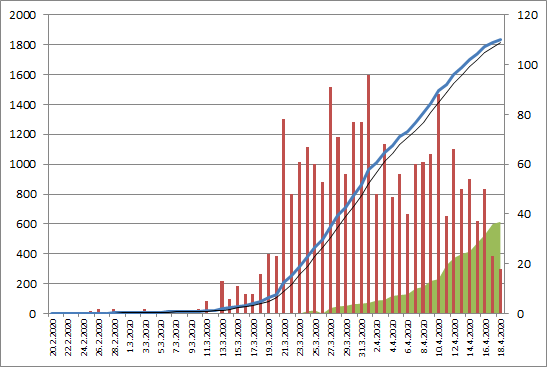
Number of patients in Croatia and trends
OK, this is known to everyone (I guess). The blue line is the total number of registered infected, the black thin line is a trend, the red columns are daily new infected and the green ones are recovered. It is important to know that Beros tells us every day how many recovered in hospitals and how many at home. This is very important. Many countries do not and have any idea how many (registered) patients have recovered at home.
But on the blue curve, it is very important that there are four areas. The first runs until March 21. when the epidemic started the way the epidemic started. From March 31 to April 1 are the results of the first measures to curb the epidemic. From April 1 to April 16 are the results of another set of measures. After April 16, though it is still too few days, something fourth is happening. Look at the slopes of the curve so you will understand.
I do not know exactly how the Croatian Institute of Public Health calculates that epidemic spread rate. Here are two ways of looking at it. The first way is looking at how many newly-infected are compared to the “ironed out” total infected. What does “ironing” mean? Croatia is small. A bus from Turkey arrives or a virus enters a home in Split or because of an earthquake we do not process all test swabs that day. But compensate for the next big changes in the curves. That is why I “iron” the curve in two ways, so that such jumps do not significantly affect this coefficient. And here’s what I get:
Ratio – how many newborns are compared to a little infested by then
The green curve is important. Not only has it been calm for quite a while (that’s when they “leveled” the upper blue curve), but what matters is what has been going on in recent days. For the last six days, this green curve is below one, which means that the spread of infection is decreasing.
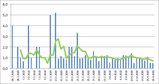
But there is one other curve, which is perhaps fairer: the relationship of the newly infected with the currently ill (thus, without recovered)! Here’s that one (unironed):
Relationship of newly infected with currently ill (thus, no recovered)
And that’s good.
I received more contributions immediately. An excellent graphical representation of the testing ratio per million population and the percentage of positives shows who optimally tests and who does not. If you are about 10% positive you have found a good measure – Croatia is. Something ugly is coming to Brazil, only if the good weather saves them.
Comparison of the number of tests per million and the percentage of positive ones – by Milan Stevanović, April 18
I was also bothered by what Zoran Milanovic told N1: “There are many things for which we have no answers, but we go over them and continue to live. In January 2017, it was calculated that the death toll was 6500 that month. However, a year earlier 4500 people. From what? 2500 people more. There were no car accidents, suicides. Two thousand people have died more than average. It’s a scary figure and we knew it and no one responded. This was probably an epidemic of more severe flu, because in this seasonal prolapse more and more die, and so it is calculated because we do not test for the flu. But when you see that 45 percent more people died in one period than normal in a 10-year average in that month, something happened, we don’t know what. “
Some people wanted to interpret it as seeing nothing happens when 2,000 people die from the flu, life doesn’t stop. But that’s the point – if the measures had not been activated the number of dead would have been at least 2,000 to 4,000 more as they die due to strong flu seasons such as 2014/2015 and 2016/2017 – see the data.
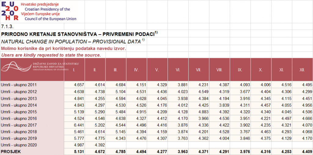
DSZ data on deaths by months
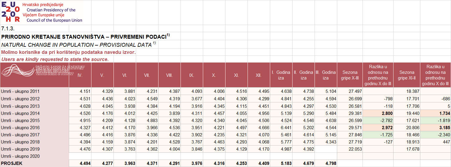
Data on deaths compounded by flu season
If you want to play and check yourself, you can find great visualizations and country comparisons here.