A new mobile application out of Split will change the lives of children with dyslexia.
OmoLab from Split, led by Petar Reić, has created a valued, completely free application for children with dyslexia, using their own font called ‘Omo Type’, reports Slobodna Dalmacija on August 11, 2018.
In order for the font to be available to everyone, the OmoLab team developed a mobile application called ‘OmoReader’ using the specified font, in cooperation with the Split company ‘Locastic’. As confirmed by Petar Reić, users of the application will find lectures, as well as some Croatian classics. Aside from being completely free of charge, OmoLab’s font is the first in the world when it comes to quality.
“Our goal is to make it easier for children with dyslexia, and encourage them to read,” Reić said, explaining that his wife and their eleven-year-old daughter are both dyslexics.
“A few years ago, my daughter had enrolled in the second grade of elementary school, and it was then that I saw something wasn’t right with her reading. I was trying to find a way to make it easier to study, but then I was completely surprised when I saw that there was no adequate tool for something that affected about ten percent of the population,” Reić added.

With time he began to develop an idea to help dyslexics and began to gather a team to help him. Reić also contacted Marko Hrastovac, one of the best European typographers, who was, among other things, a co-author of the font used in the Paris museum the Louvre. They gathered ideas, ran tests, and eventually turned everything into a single project. They also sought financial assistance and approached the Swedish Reach for Change Foundation, which was the first to support them.
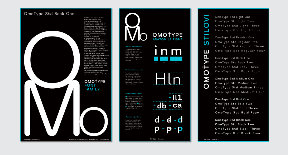
They then came up with logos, designers and child psychologists who helped them direct the project. The result of their collaboration is the creation of OmoType, a font that has 48 different versions, making it actually customizable to children with different forms of dyslexia.
“The font’s specialty is that it leaves enough space between the letters so the mirror-like letters are differently shaped, which in effect prevents people with dyslexia from replacing, say, letters B and D. The font has six different levels of letter thickness and four different spaces between the letters. That gap is crucial in identifying letters for dyslexic people. The user, parent, or therapist can estimate which font best suits the child to achieve the best results,” he clarified.
They have also run tests, and so far, they are all more than pleasantly surprised by the results of the app, which should be available in less than 20 days.
During the font’s development, the team conducted their own tests, and in September, they will apply for a grant from the Ministry of Science and Education to provide funding for the right scientific research to work in cooperation with faculties, such as education and rehabilitation.
“We also completed our independent testing conducted by the professor of Logopedics, in collaboration with the Dyxy association and the children’s polyclinic in Split. We tested it on children with reading disorders that were divided into 15 groups with 15 children between the ages of 10 and 14. One of the four fonts we used is the OmoType. Only one of our 48 versions of OmoType was used for testing, which had excellent results. If the adaptability was even greater by using all 48 versions of the font, the results would certainly be even better,” Reić continued, adding that they made a font system that can be customized to meet the unique needs of users to make reading easier.
Their business model, as the OmoLab team clarified, is a permanent crowdfunding campaign, as new products are being developed constantly
In addition, they want to create a positive environment for children with dyslexia. Croatia, as a market, is viewed as a kind of incubator.
“We can test our tools in Croatia and then monetize them in the global market. This is actually our general idea behind it. Our next project after OmoReader is the development of a new application that will connect the letter animation with a suitable sound, or jingle, which will last for one to three seconds. By listening to jingles that are compounded by letters or words, children may hear the sound of concepts or their name. This way, we would actually bring the children closer to the letters in a more entertaining way,” Reić concluded.


